What Should The Cover Of My New Book Be?
A subscriber poll -- let my publisher and me know what you think
Hello all. My publisher has given me permission to poll the room to get fan feedback on proposed designs for my new enchantment book. They gave me seven designs. I passed them around among a few friends. There was no consensus, but the three I share with you below got the most nods.
Which of these do you like? Why do you like them? Why do you dislike others? I’d love your thoughts — your input really matters. We have to make a decision this week.
Here’s Number 1:
I think formally, this one is the best, but what keeps me from calling it my favorite is that it feels cold. And I don’t like the orange and the green colors. Nevertheless, of the friends I’ve polled, this one is a slight favorite. Two different people said of all the covers I showed them, this is the one they would not pass by in a bookstore. I think I would like to see a small cross embedded in the sun, to convey to readers that this book is oriented toward Christianity.
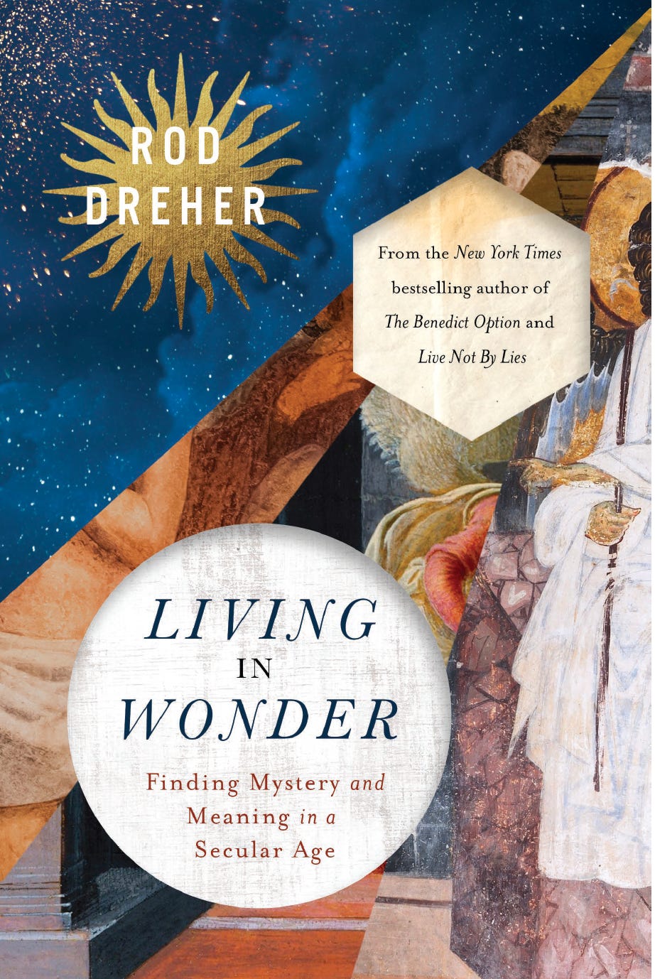
Here’s Number 2:
This one is my favorite. I love the richness of color, and the texture. I think it best conveys the vividness of the text itself. Similarly, I would like to see some small cross somewhere, to signal the Christian content to readers. Two others I polled said this is their favorite, and nothing else was close.
Here’s Number 3:
I like it because of the stained glass effect, symbolizing sanctity, but also because it conveys a sense of order amid fragmentation — a key theme of the book. Do you think this seems “Christian” enough, though?
About the Christian thing: this is a book that can profitably be read by anybody, I believe. I am up front early in the book that the “enchantment” I talk about refers to establishing a living relationship with the God of the Bible. I don’t want to bait-and-switch potential book buyers.
So, what do you think? Please be as elaborate in your judgments as you can, in the comments. What you have to say really will make a difference.


Option 2, but don’t put your name right over the starburst, make the starburst smaller and above your name
#3. I can only say that the first two give me a little anxiety, while the stained-glass window version brings a sense of peace through its beauty and symmetry. Not great art criticism, but that's my vote.